Bookmarkable hash pages
Being able to bookmark something like a hash URL that contains a popped up image is not a simple thing to implement in raw JavaScript.
In Active CSS, all that is needed once you have set up all your underlying page, is to add a further declaration into a @pages declaration to make your hashed page bookmarkable and able to respond to all the browser navigation events as expected.
The hash doesn't have to open up a modal window - it can do whatever you want - but a common use case is for a popped up image, so this is the example that is used here.
You don't even need to convert your whole site into an SPA for this to work. You just need to have your underlying page already set up in @pages.
See the other documentation or the tutorial on how to do that.
This method will work on both types of SPA that Active CSS supports, regular ajax websites and offline interactive websites.
Concept
- User clicks on a link that contains a hash in the URL.
- The underlying page is drawn, per the previous documentation method.
- The event then runs that opens up your modal, and that event is retrieved from @pages. If you want it can be in an embedded ACSS tag stored in the underlying page if you happen to have more than one hash with the same name. Example of a hash event:
@pages {
    "#horse": event="#imgHorse:click";
}
That's about all there is to it. The rest of the code that you need is more directly related to event interactions and not to this bookmarkable/SPA aspect.
Description
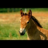
Let's say you had an image that opened up a modal, like this one from the full example below:
<img id="imgHorse" data-hash="horse" src="/images/horse_tn.jpg" data-pop-img="/images/horse.jpg" alt="horse">
Now that doesn't do anything by itself - it's from the full example at the bottom of the page and there are events set up to open up a modal window and display the image (see the full example at the bottom of the page). Those events are not really anything to do with the SPA aspect of what is being talked about here.
This next bit is the important bit. To make the popped up image bookmarkable, you need to add the event into @pages that will open up the modal window.
For example:
@pages {
    "#horse": event="#imgHorse:click";
}
Internally, the underlying page is drawn and then any associated "hash events" are run.
That's all you have to do to make the page bookmarkable and responsive to browser navigation. I'll do a full tutorial on this at some point, but basically if you already have an SPA written in Active CSS, you only need to add the @pages declaration for the hash event to make your hash URLs bookmarkable.
Here is the full example (try it out by using the browser arrows and hitting refresh):
Bookmarkable SPA image gallery
@pages {
"#corridor": event="#imgCorridor:click";
"#horse": event="#imgHorse:click";
"#house": event="#imgHouse:click";
"#ville-france": event="#imgVilleFrance:click";
"#autumn-leaves": event="#imgAutumnLeaves:click";
}
img[data-pop-img]:click {
add-hash: "#{@data-hash}" "SPA image modal - {@alt}" remove-last-hash;
$modalImage: "{@data-hash}";
.str-ModalBack {
render: "{|poppedUpImage}";
add-class: .spaImgPopup;
}
}
.modal-button:click {
stop-propagation: true;
}
.spa-modal-left-button:click {
click-on-previous-cycle: img[data-pop-img] starting-from(img[data-hash="{$modalImage}"]);
}
.spa-modal-right-button:click {
click-on-next-cycle: img[data-pop-img] starting-from(img[data-hash="{$modalImage}"]);
}
@component poppedUpImage {
html {
<img src="{@data-pop-img}" class="imgPopupItem" data-hash-popped="{@data-hash}" alt="{@alt}" title="{@alt}">
<div class="spa-modal-left-button modal-button">➧</div>
<div class="spa-modal-right-button modal-button">➧</div>
}
}
.str-ModalBack.spaImgPopup:click {
.str-ModalBack img {
remove-hash: "#{@data-hash-popped}" "SPA image modal";
}
remove-class: .spaImgPopup;
render: "";
}
/* This also needs to be in your main site config and not in an embedded ACSS tag:
1) The @pages declaration to the underlying gallery page (see the tutorials).
@pages {
your gallery page goes here alongside any other SPA pages
}
2) A popstate event which is responsible for closing the modal when the user navigates away from the gallery by using browser navigation.
window:popstate {
.str-ModalBack {
render: "";
remove-class: .spaImgPopup;
}
}
*/
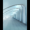
<img id="imgCorridor" data-hash="corridor" src="/images/corridor_tn.jpg" data-pop-img="/images/corridor.jpg" alt="corridor">
<img id="imgHorse" data-hash="horse" src="/images/horse_tn.jpg" data-pop-img="/images/horse.jpg" alt="horse">
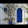
<img id="imgHouse" data-hash="house" src="/images/house_tn.jpg" data-pop-img="/images/house.jpg" alt="house">
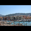
<img id="imgVilleFrance" data-hash="ville-france" src="/images/ville-france_tn.jpg" data-pop-img="/images/ville-france.jpg" alt="town in france">
<img id="imgAutumnLeaves" data-hash="autumn-leaves" src="/images/autumn-leaves_tn.jpg" data-pop-img="/images/autumn-leaves.jpg" alt="autumn leaves">
<!-- Plus place this code somewhere on your page where a modal background will display full screen...
<div class="str-ModalBack"></div>
-->
.str-ModalBack.spaImgPopup {
    position: fixed;
    display: block;
    top: 0;
    right: 0;
    bottom: 0;
    left: 0;
    background-color: rgba(0, 0, 0, 0.9);
    z-index: 1000;
    cursor: pointer;
}

.imgPopupItem {
    position: absolute;
    top: 50%;
    left: 50%;
    max-height: 100%;
    max-width: 100%;
    transform: translate(-50%, -50%);
}

img[data-pop-img] {
    cursor: pointer;
}

.modal-button {
    position: absolute;
    top: calc(50% - 25px);
    background-color: lightgray;
    color: #111;
    border-radius: 8px;
    user-select: none;
    font-size: 32px;
    transition: background-color linear 250ms;
}

.spa-modal-left-button {
    left: 20px;
    padding: 8px 20px 12px 20px;
    transform: rotate(180deg);
}

.spa-modal-right-button {
    right: 20px;
    padding: 7px 17px 13px 23px;
}

.modal-button:hover {
    background-color: lightgreen;
}

