SPA image modal gallery
This example builds on the previous Simple image modal example.
It is possible to turn that example into a popup gallery, with navigation buttons inside the modal to cycle through the images, just by using Active CSS. For this, we use something called hash routing, as it relies on the value of the hash in the url to work out what to draw on the page.
By employing the SPA @pages syntax for hash routing, we can make the popped-up pages bookmarkable, and fully responsive to the browser navigation buttons, such as the back arrow, forward arrow, previous history and refresh buttons, even when clicked on randomly. It should also keep you inside your SPA after fresh page reloads on any page. The SPA routing technology in Active CSS is a bit easier to learn than having to use an MVC framework to do the same thing on the front-end. It works perfectly with static HTML, for the optimum in performance, but will still work with dynamic pages, generated on-the-fly by your server code.
To get the browser navigation to work with hash "events", this is the basic concept:
1) Switch pages to draw the underlying page when a page link is clicked on.
2) Now that the underlying page has drawn, trigger the event which will open the modal.
Very A to B. Internally the ACSS core does the complex stuff behind the scenes. You only need to write the simple routing declarations in your config.
Active CSS hash routing works in much the same way as the regular page routing used in @pages. It relies on having the data in memory necessary to open up the modal once the underlying page has been drawn.
So to make this work, you need to:
- Ensure that your underlying page is declared in @pages. This underlying page declaration needs to be in site-wide config, not embedded config. This is important in order to get your page links working. So all the main page (non-hash) declarations need to be available at all times. If you've already got these set up for a non-hash SPA, then you've already done this step. To understand how this step works, it is covered fully in the SPA section of the docs and this tutorial. Read those carefully if you haven't already.
- Ensure that the element that the user would normally interact with to open the modal is available on the underlying page when it loads. This should be obvious, but I'm mentioning it in case it isn't.
- Add a hash event in a @pages declaration which will trigger the modal once the page has been drawn. This is worked out and written by looking at which event will open the modal. The hash @pages declaration can either be within any embedded config declaration on the underlying page, or in your site-wide config declarations. It doesn't matter, because the core will only trigger the hash event once the page is fully loaded, so the event can be embedded and making it embedded will make it unique to that page.
Have a look at the example code for this, and play around with the browser buttons. I've not put this in the code editor, so that you can see the effects on the URL when you navigate around.
Bookmarkable SPA image gallery
@pages {
"#corridor": event="#imgCorridor:click";
"#horse": event="#imgHorse:click";
"#house": event="#imgHouse:click";
"#ville-france": event="#imgVilleFrance:click";
"#autumn-leaves": event="#imgAutumnLeaves:click";
}
img[data-pop-img]:click {
add-hash: "#{@data-hash}" "SPA image modal - {@alt}" remove-last-hash;
$modalImage: "{@data-hash}";
.str-ModalBack {
render: "{|poppedUpImage}";
add-class: .spaImgPopup;
}
}
.modal-button:click {
stop-propagation: true;
}
.spa-modal-left-button:click {
click-on-previous-cycle: img[data-pop-img] starting-from(img[data-hash="{$modalImage}"]);
}
.spa-modal-right-button:click {
click-on-next-cycle: img[data-pop-img] starting-from(img[data-hash="{$modalImage}"]);
}
@component poppedUpImage {
html {
<img src="{@data-pop-img}" class="imgPopupItem" data-hash-popped="{@data-hash}" alt="{@alt}" title="{@alt}">
<div class="spa-modal-left-button modal-button">➧</div>
<div class="spa-modal-right-button modal-button">➧</div>
}
}
.str-ModalBack.spaImgPopup:click {
.str-ModalBack img {
remove-hash: "#{@data-hash-popped}" "SPA image modal";
}
remove-class: .spaImgPopup;
render: "";
}
/* This also needs to be in your main site config and not in an embedded ACSS tag:
1) The @pages declaration to the underlying gallery page (see the tutorials).
@pages {
your gallery page goes here alongside any other SPA pages
}
2) A popstate event which is responsible for closing the modal when the user navigates away from the gallery by using browser navigation.
window:popstate {
.str-ModalBack {
render: "";
remove-class: .spaImgPopup;
}
}
*/
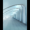
<img id="imgCorridor" data-hash="corridor" src="/images/corridor_tn.jpg" data-pop-img="/images/corridor.jpg" alt="corridor">
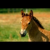
<img id="imgHorse" data-hash="horse" src="/images/horse_tn.jpg" data-pop-img="/images/horse.jpg" alt="horse">
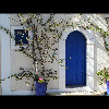
<img id="imgHouse" data-hash="house" src="/images/house_tn.jpg" data-pop-img="/images/house.jpg" alt="house">
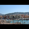
<img id="imgVilleFrance" data-hash="ville-france" src="/images/ville-france_tn.jpg" data-pop-img="/images/ville-france.jpg" alt="town in france">
<img id="imgAutumnLeaves" data-hash="autumn-leaves" src="/images/autumn-leaves_tn.jpg" data-pop-img="/images/autumn-leaves.jpg" alt="autumn leaves">
<!-- Plus place this code somewhere on your page where a modal background will display full screen...
<div class="str-ModalBack"></div>
-->
.str-ModalBack.spaImgPopup {
    position: fixed;
    display: block;
    top: 0;
    right: 0;
    bottom: 0;
    left: 0;
    background-color: rgba(0, 0, 0, 0.9);
    z-index: 1000;
    cursor: pointer;
}

.imgPopupItem {
    position: absolute;
    top: 50%;
    left: 50%;
    max-height: 100%;
    max-width: 100%;
    transform: translate(-50%, -50%);
}

img[data-pop-img] {
    cursor: pointer;
}

.modal-button {
    position: absolute;
    top: calc(50% - 25px);
    background-color: lightgray;
    color: #111;
    border-radius: 8px;
    user-select: none;
    font-size: 32px;
    transition: background-color linear 250ms;
}

.spa-modal-left-button {
    left: 20px;
    padding: 8px 20px 12px 20px;
    transform: rotate(180deg);
}

.spa-modal-right-button {
    right: 20px;
    padding: 7px 17px 13px 23px;
}

.modal-button:hover {
    background-color: lightgreen;
}

